Your website is generating traffic, but does it let you start a conversation with visitors? If you haven’t already done so, it’s vital that you add a contact form to your website.
Having a contact form is essential if you want to maximise your website’s return on investment. You can use it to generate marketing leads, help maintain relationships with customers, or simply answer questions from visitors.
So how can you create your own contact form? Which tool should you use to do so? We’ll tell you everything you need to know in the post below.
How does a contact form work?
A contact form is a short online form published on a website. Visitors can fill it out and use it to send a message to the owner of the website. Once the form is completed, visitors typically receive an automated email confirming that their enquiry is being dealt with.
And each time someone fills out a form, you receive an alert with the information provided by the visitor who has completed it. This lets you handle their request and keep track of all communication with the visitor concerned in the tool you used to create the form.
Why you need a contact form on your website
Contact forms are extremely useful and let you perform a number of different tasks.
Collect enquiries from website visitors
Having a contact form on your website is vital if you want to give visitors the chance to start a conversation with your business. This can involve a visitor asking you for information, providing you with feedback on your content or your offer, sending you a specific request, or suggesting a business partnership.
A contact form differs from a form to request a quote or a product demo because it can be used in many different situations. It’s important then that you have one on your website so that visitors can contact you when they need to.
Reduce spam
By using a contact form instead of displaying your company’s email address on your website, you can greatly reduce the amount of spam and unsolicited messages you receive.
Build your marketing contact database
Contact forms are also the perfect opportunity to build your contact database. For example, you can have visitors fill out a contact form to sign up to your newsletter or marketing communications.
Keep track of interactions with leads
Some form builder tools let you create a dedicated record for each of your contacts. This will enable you to keep track of all the different interactions this visitor has with your website (e.g., content viewed, web pages viewed).
This will then help your sales reps find the best way to approach individual leads.
How to create a contact form
1. Choose a form builder tool
There are a number of different ways you can create a contact form for your website. These include a number of both free and paid tools or plugins, like Plezi One, Gravity Forms, Google Forms, WPForms, or Contact Form 7.
It’s a good idea to choose a tool that can be easily integrated with your CMS. This will make it easy to create contact forms and add them to your website using the available plugins.
In this post, we’ll tell you how to create a contact form using Plezi One. This is our free tool which lets you easily create online forms and collect information from visitors. Plezi One is also available as a WordPress plugin, enabling you to add forms to your website directly in WordPress.
2. Decide what information you want to collect
This is an extremely important step in designing your form because it will directly affect the results that your form delivers. It can be tempting to ask visitors for as much information as possible so that you can know everything about them straight away. This might include the company they work for, their needs, their budget, their favourite colour, or what they had for dinner the day before!
But the more information your form asks for, the greater the risk that visitors will be put off and leave your website without completing it.
It’s a much better idea to just ask for the essential information at this point. Typically, this will include:
- First and last name
- Email address
- Company
- Phone number
- A blank field that lets a visitor provide some details about their enquiry or request
In addition to this information, you could add fields for things like a postal address, the subject of the enquiry, or whether the visitor is already a customer.
3. Ensure your contact form complies with the GDPR
Since 2018, the GDPR (General Data Protection Regulation) has required you to collect the consent of website visitors when they provide you with personal information.
When this information is collected using a contact form, you will at the very least use it to contact these visitors again. This means that you need to add a short text to notify visitors of your intention to do this and a checkbox for them to give their consent.
Here’s the message we use at Plezi:
By submitting this form, you agree that THE COMPANY will store and use your personal data in order to be able to contact you. The website publisher undertakes not to share your contact information with a third party or use it for advertising.
And for the checkbox:
I agree that THE COMPANY may contact me
4. Design your contact form
Ensuring that your contact form is well designed is important for two reasons:
- so that your form produces the best possible results (because no one likes filling out unappealing or unreadable forms)
- it matches the visual identity of your website (and your brand identity)
Ideally all fields should be clearly marked with labels that can be easily read. Your send button should also stand out from the surrounding background, typically by using a lighter or contrasting colour. Required fields are usually marked with an asterisk.
Plezi One lets you easily control all the different contact form parameters. For example, the colour of the font used and background, the size of fields, the font size, as well as the button design.
Also pay attention to the text used on the send button. Rather than using a simple “Click here”, include a strong action verb like “Send” or “Send my enquiry”.
When designing your form, you should make sure it meets the visual identity guidelines for your website. This will ensure that the forms you create in the future will all match this.
5. Write an automated confirmation email
You can set up an automated confirmation email to reassure visitors that their enquiry is being dealt with. This automated email will be sent as soon as you receive a contact from enquiry. You can personalize this email using information provided by the visitor, like their first name or the company they work for.
In this email, you should also specify what will happen next. Should the visitor expect an email or call from you? Roughly when can they expect this?
Here’s an example of the sort of message we use at Plezi:
Hi FIRST NAME,
Thanks for contacting us.
You’ll be hearing from us soon, so keep an eye on your inbox.
In the meantime, if you’d like to learn more about us and explore our content, feel free to check out our blog or download our online resources.
Have a great day,
The Plezi team
Using our free Plezi One tool, you can easily set up this kind of automated message in “Follow-up emails”.
And finally, once a visitor has completed a contact form, be sure to direct them to a thank you page.
6. Add the contact form to your website
Now that you’ve created your contact form, all you have to do is put it on your website.
Most websites nowadays have a dedicated contact page. These pages are usually short and get straight to the point. They often only include the contact form, and sometimes also a phone number for those in a hurry.
There are two main ways to add a form to your website, depending on the form builder tool you use.
- You can embed the form manually on your contact page, by inserting the appropriate HTML script.
- If your tool is available as a WordPress plugin, you can embed the form directly in WordPress. For example, using the Plezi One plugin, you can simply drag and drop your contact form into your web pages.
Two contact form templates
So, what exactly should a contact form look like? To help give you some ideas, here are two templates created using Plezi One. Choose which one suits your needs best.
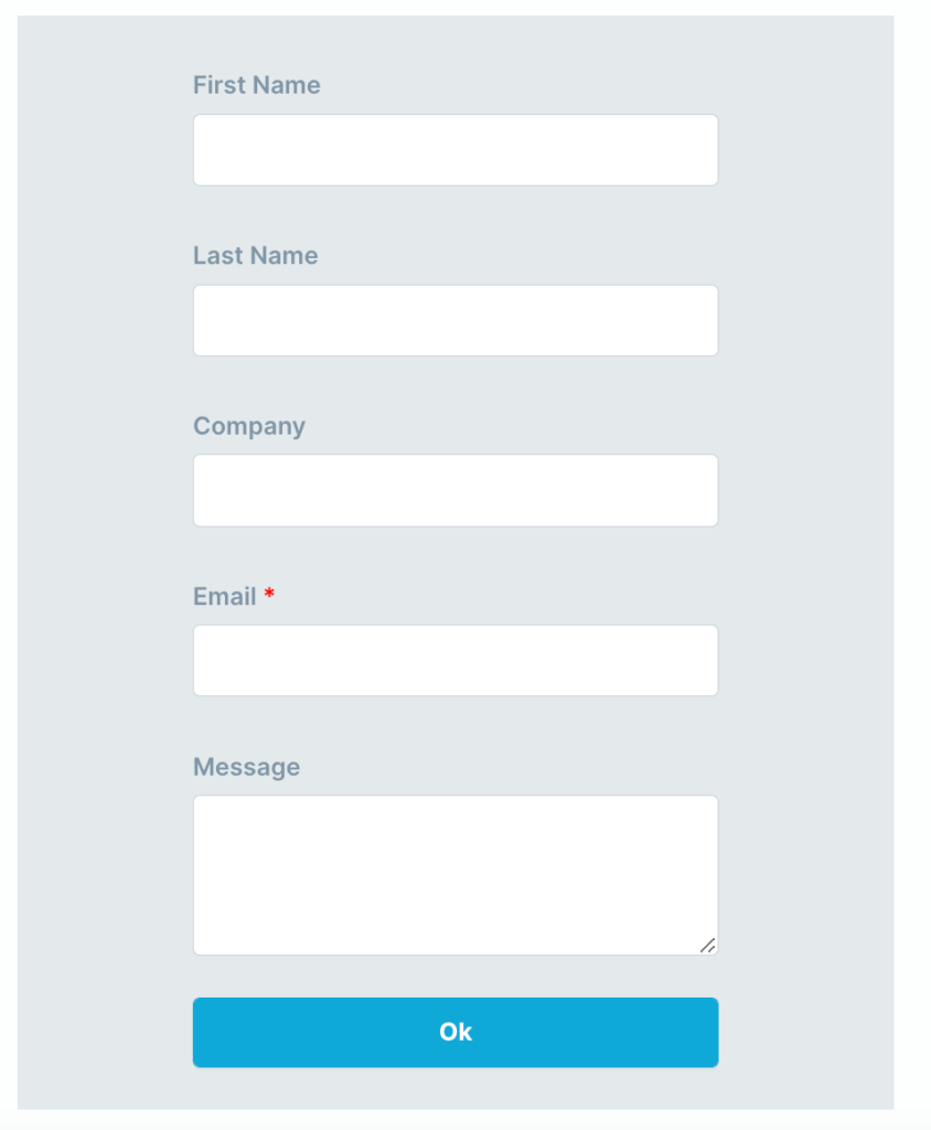
1. The standard form
Below is a very simple contact form layout. It only asks for strictly essential information, thereby ensuring that visitors have a greater chance of filling it out.
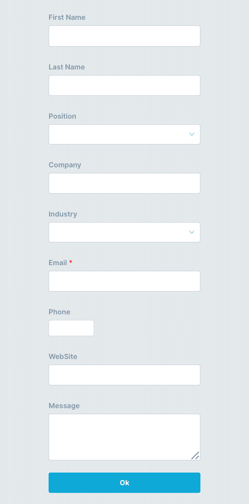
2. The advanced form
This contact form asks for more information, enabling you to better filter incoming enquiries. However, a smaller number of visitors might be inclined to fill it out because it takes a bit more time to do so. To counter this, you can give visitors some flexibility by making only the most important fields required information. This lets visitors choose whether they provide the additional information or not.
Having a contact form on your website is vital if you want to generate marketing leads or let customers easily get in touch with your business. Fortunately, as you’ve seen above, contact forms are easy to create using the right tools and they don’t need to cost an arm and a leg.
So, are you ready to create your first contact form? Why not try using Plezi One to do just that?


