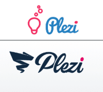
When you came to this article you will probably have noticed: Plezi’d identity has changed. This step represents a significant milestone for the company, its clients and its partners, but also all of our faithful blog readers. Why? How? Sit back, relax and enjoy the story…
It’s a milestone! More than that even…
Plezi’s identity dates back to 2016, a period of commercial development for the app and for establishing the brand on the market. Plezi wanted to stand out from its competitors and tech companies by adopting a fun, ambitious and human identity.
Since then, its values haven’t changed, but the company has:
- The team has grown from 5 to 32 people.
- The number of clients should soon reach 300 businesses.
- We have just raised €3 million to support this incredible growth.
The time therefore came to take a leap and create a new skin for Plezi.
What are the aims of this identity and website refresh?
Over the years, we have discovered the difficulties of creating a human-centric and quirky brand. The recurring presence of team photos on the site created confusion among visitors who sometimes took us for an agency. Our superheroes are hard to shake off, as is the “startup” label.
In the meantime, our gradient from blue to green has been copied, worked and reworked. The frames on our website lacked curves while the navigation between pages seemed to age overnight.
So, we took on this refresh with a desire to pass a milestone and to be recognised as an innovative and reliable software publisher. It is therefore firstly about brand strategy.
The second aim is related to the website and lead generation. Naturally, we had a very high average conversion rate on the site of 7.23% over the first eight months of 2019. But we felt that we could do even better, particularly on product-related requests.
This new website should therefore give visitors a desire to leave their contact information.
How what we didn’t want has led to the final result
When refreshing an identity and website, one usually starts with specifications listing what you want. But it’s also important to list what you don’t want.
From the outset we were sure of one thing: we were not going to change Plezi’s colours. Over the years, the blue of the logo had been replaced by a darker blue, like on our e-books or Plezi Day visuals. We are keeping these colours that really reflect Plezi’s blend of professionalism and fun. Incidentally, this also means we don’t have to repaint the walls in our new office!
For the logo, we almost succumbed to the allure of clean logos with simple lowercase typography, like Facebook and 80% of start-ups. Lowercase lettering pulls you down with the p, so this proposal was rejected:
It was when the various different logo options were presented to the whole team that we became sure of certain things:
- The handwritten style is our own and reflects our human side. It is rounded, seamless and dynamic, looking skyward.
- We wanted the name of the company to be able to work without the logotype / icon.
- The tornado was chosen for its dynamism and its reference to the sales funnel.
After several meetings we had a result: change in the continuity. The new Plezi has arrived:
On the website, we also knew what we didn’t want: to be just another start-up, with illustrations of faceless people, or ever small abstract shapes in pastel colours on white backgrounds.
This work was undoubtedly more complicated than the logo was. It took a whole month to find the right combination of colour gradient, texture, curves and illustrations. Naturally, we still have “stock images” on our home page, which will gradually be replaced by our real clients, but this was the price to pay for launching a new identity and a new website in just… three months!
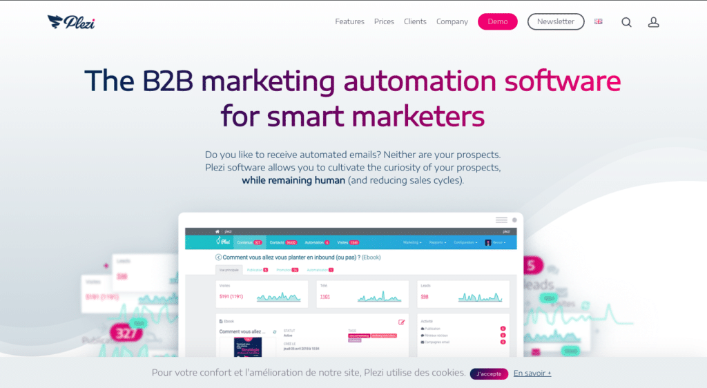
So why not take a look at our new
Don’t hesitate to tell us what you think of this new identity in the comments


